Creating This Website
Posted: April 14, 2019 (Edited: April 21, 2019)
Introduction
I have had a personal website since 2016 when I realized that not only was matthewvanbommel.com still available, but I could own it for just $10 a year! Combined with the realization that I could host the site on GitHub Pages for free, it became a no-brainer to have a personal website. Since then, my site has gone through several design iterations, none of which I have been entirely satisfied with. Given that dissatisfaction, and an increased interest in building web applications, I decided to do a complete redesign of my website, building it from the ground up. This task felt intimidating for someone whose previous web development experience consisted entirely of a "How Websites Work" course in my college undergrad and editing templates to build previous iterations of this website, thus I set out with realistic goals in mind:
- Learn about HTML, CSS, and web design, and improve my skills in those domains
- Create a functioning website (and hopefully make it look decent)
The code used for this site is available on GitHub.
Bootstrap
One of the first decisions I made is that I would be using the Bootstrap framework. Bootstrap was originally created at Twitter and is now one of the most popular front-end frameworks, while being completely open source. Bootstrap emphasizes responsive web design, allowing websites to look good across a variety of screen sizes and devices: a near necessity in today's digital age. Having created Shiny apps, I was also a little familiar with the basic concepts of Bootstrap, specifically the grid system that underlies the basic design structure. Getting up and running with Bootstrap was pretty straightforward using this tutorial to understand the basic concepts and making use of its excellent documentation to fill in any gaps.
On the whole, I found Bootstrap to be fairly intuitive, and pretty good at helping to scale design to different devices - certainly incredibly simple compared to the alternative of building everything from scratch myself. However I did have one major Bootstrap related headache during this process. The official Bootstrap website has some great examples of some of the different features and styles you can implement. As such, I was using the dashboard example to figure out how to add the sidebar (not displayed on mobile) and though I appeared to completely mirror the code, it looked different on my site than it did in the example. After a lot of search and much confusion, I finally realized that I was using an outdated version of Bootstrap - I was using v3 (thanks to copying and pasting a Stack Overflow snippet) while the example was using the up to date v4. Thankful to have finally found the source of the issue, I updated my references to v4, only to have my site look completely different than it did in v3. Despite my defeated feeling and my decision to give up for the night, bringing the site back to its previous glory proved a fairly simple task thanks to Bootstrap's excellent migration documentation. Aside from that mix-up, it was fairly smooth sailing with Bootstrap (at least relative to the rest of my struggles) and I certainly recommend it to someone building their own responsive website.
Design
The overall structure of the page follows a fairly standard Bootstrap layout: a navbar at the top, followed by the content, and a footer at the bottom - with an additional sidebar on the content pages for screens with a wide enough view. The navbar and sidebar are both fixed - meaning they maintain constant position on the screen as the user scrolls. Finally, the home page makes use of a full page background image, which scales to fill the screen regardless of its dimensions.
Responsiveness
Bootstrap makes a lot of aspects of responsive design straightforward. For example:
- columns are automatically resized so that the full width of the screen is used
- columns placed side-by-side are stacked vertically when the screen display size is below a defined width
- images scale in size with the screen dimensions
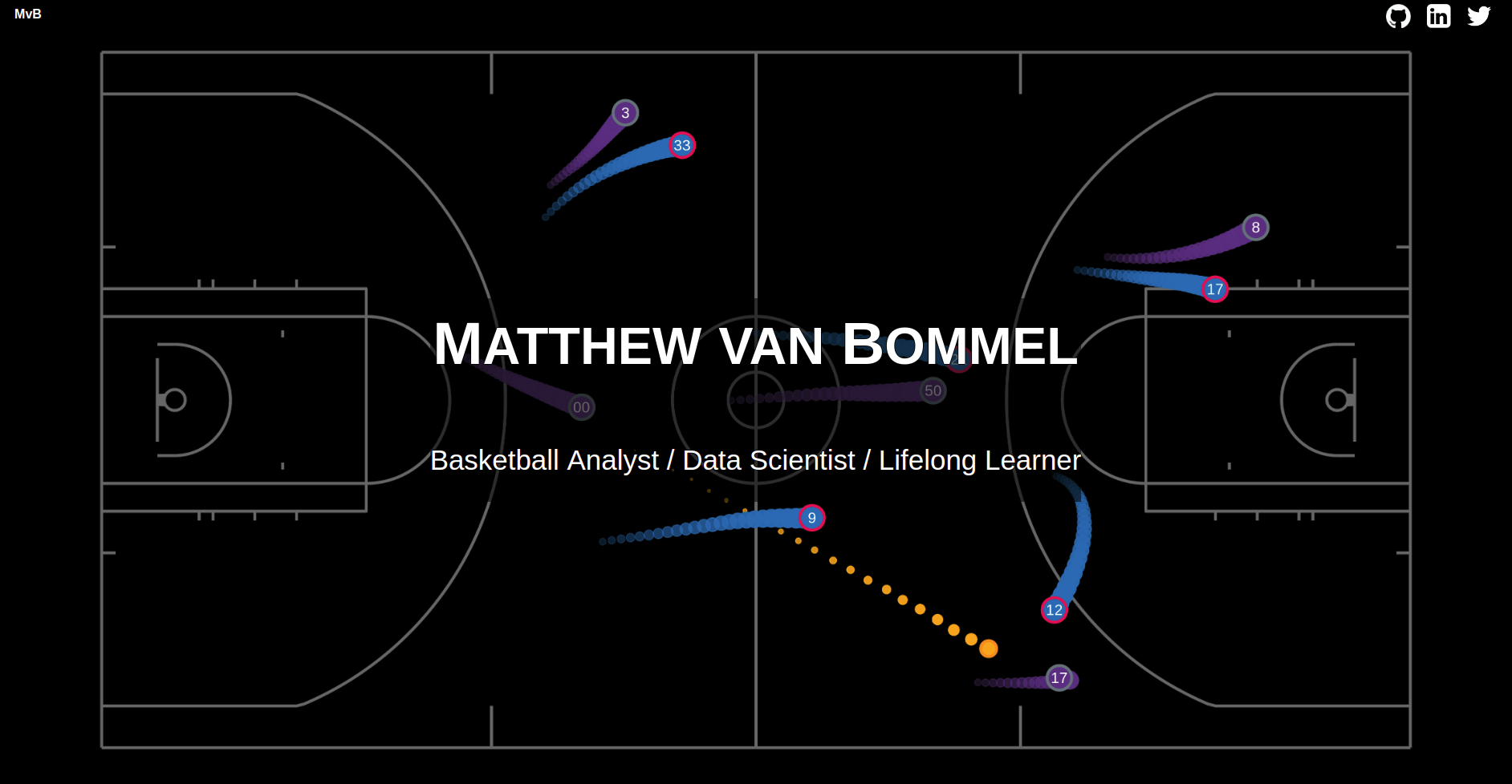
I added a few additional components of responsive design. The main image on the homepage switches depending on the screen ratio: wide screens present an image of a court stretching east to west while tall screens present a court spanning north to south. In a similar vein, narrow screens have no sidebar displayed on the content pages to maximize screen real estate. The navbar icons are also moved to a dropdown menu on narrow screens to ensure they never span the entire screen width and overlap the home button.
I was surprised to learn that Bootstrap
does not include a method to adjust font size as the screen dimension changes, however I was
able to accomplish this feature using the
calc() function as presented in this guide on fluid
typography. I
opted for a minimum font size of 16px that stretches all the way up to 24px for larger
displays. These sizes are much larger than I originally
anticipated, but were strongly supported in this guide.
One gem from the guide: the publishing platform Medium has a default text size of 21px! When text is the
main feature of a site, making sure it is easy to read is of
critical importance.
Colour
Given that the majority of content on this site is going to be text based posts or descriptions of projects, I tried to emphasize readability in my choices for the end design: thus the dark gray text on a white background. For continuity, I repeated the same shade of gray for the header and footer, inverting the text and icons to white. Hopefully the result is a clean and simple design that doesn't distract or remove any attention from the actual content.
The final emphasis on readability is a stark contrast to the inverted (white text on black background) initial design I selected. There are many things I like about inverted designs: they stand out and can look super slick if done well. I especially liked the aesthetic on the home page of this site. However, in researching best practices for dark design, I found a few articles that talked me down from a dark design, to something more traditional, and I think the decision improved the final product.
Icons
Most companies make it very easy to use their logos to link to their websites. I found brand resource pages for the three external links in my navigation bar (GitHub, Twitter, and LinkedIn) where I could download the logos with transparent backgrounds. Additional icons (like on the project boxes on the homepage) were obtained from Icons8 - a great library of icons that even lets you edit the colors and backgrounds for many of them.
Lessons
Chrome's Inspect Tool
Google Chrome's DevTools are a set of tools built into Chrome (other browsers have similar toolsets). I knew about DevTools before I started this project but I did not know how powerful they could be. Some highlights include:
- simulating mobile devices (and other screen sizes) to see how a website will appear in different environments
- determining the size, padding, and margins of different components
- figuring out exactly which styling elements are impacting a component, and determining the source for each element
- live testing of HTML and CSS changes, without editing your actual source code
This project involved many hours spent using DevTools, and while progress was quite slow at first, I have drastically increased my skills in using the tools and tracking down errors throughout the process.
Styles Ordering
At the start of this project, I naively put no thought into the ordering of style elements (including placing the reference to Bootstrap's stylesheet after the reference to my custom stylesheet and being confused when I could not alter Bootstrap styles). However, several experiences have taught me that the ordering of styles is crucial, most simply because if multiple styles conflict, priority is given to the last style applied.
The Important Keyword
At one stage, I could not figure out how to override a particular Bootstrap style with my
own custom styling. After a quick search, I came across the
!important keyword, which can be added to a line of styling to give it priority
(ignoring the order of styles) - an excellent solution!
Soon my stylesheet grew filled with !important keywords to solve all sorts of
styling issues. At this point I looked at my stylesheet
and thought "this cannot be good practice". Further searching confirmed that thought. Sure,
I had accomplished the desired results, but using a
sort of 'cheat code' that would complicate future development. Removing all
!important keywords involved finding the actual causes of
the conflicts, and determining the correct way to resolve them. This corrective process
resulted in a deeper understanding of the codebase and
facilitated easier future changes.
Media Queries
CSS @media queries return information about the device accessing your website
and thus allow the content to be altered depending on factors including
the type, size, or orientation of the device. Bootstrap uses @media queries in
creating responsive design and it is straightforward to add
additional custom @media queries. This site uses @media queries to
determine the orientation of the court on the homepage and whether to display the
sidebar.
Sidebar Links
Linking to a section (in my case a header) on a page is fairly straightforward through the
use of an id. However, the links move the
header of interest to
the very top of the page, which is directly behind my fixed navbar. Thus I needed a solution
to move the header of interest to just below the top of
the page. I was pleased to realize that padding proved to be a fairly elegant solution to
this issue: padding does not change the starting point of a
header, so the links would lead to the top of the padding rather than where the text begins.
As such, I was able to fix the issue using the
following class:
  .linked-header {
      padding-top: 45px; /* Height of navbar */
      padding-bottom: 20px; /* Add padding on bottom to even it out a bit */
  }
Different Browsers and Operating Systems
Different browsers can display the same website differently, which is why I was sure to test my site with several common browsers. I installed Chrome, Firefox, and Opera locally on the Linux machine I used during development. I was able to test Edge on the same machine by using the free Edge testing offer from BrowserStack.
While I knew before I began this project that it would be important to test the results across browsers, I did not realize it is also important to test across operating systems. Even keeping the browser constant, sites can be displayed differently across operating systems. For example, the icons in my navbar looked great in Chrome on both Linux and Windows, but were stretched out when viewed on a Mac. Typically, you need either access to copies of each operating system you want to test or a willingness to pay for a service (like BrowserStack mentioned above) that can generate virtual environments of browser and operating system combinations. However, I discovered the free Browser Shots site, which is able to capture screenshots of a site from a variety of browsers and operating systems. While the service has its restrictions (no ability to live test, slow generation of screen shots, limited number of tests per day) it can be a great way to perform a quick test without spending any money.
Hopefully, I have been able to catch all the inconsistencies across browsers and operating systems, but there is certainly a possibility a bug has slipped through the cracks. So if you notice anything that you think might look a little off with this site, be sure to let me know!
Conclusion
Reflecting on my two stated goals from the introduction, I have no doubt that I vastly increased my knowledge of HTML, CSS, and web design throughout the process of creating this website and I succeeded in creating a functional website (which I would say looks at least half decent, if not all the way there). I also gained a lot of appreciation for front end development, UX design, and UI design.
Would I recommend the process of building a website from the ground up? For most people, the answer would be no. This process took much more time than I originally anticipated, much of it spent either staring at DevTools trying to figure out why the change I made did not actually change anything or searching through Stack Overflow in search of someone with an identical (or at least similar enough) situation. Given the huge variety of website building tools and templates out there, if your main goal is simply to create a website, you can get a lot more for a lot less work by not starting from scratch. But if your goal is to increase your knowledge of web design or the tools associated with it and you are realistic about the time commitment, then building your own website can be a great option. For me, building a website presented a similar problem solving aspect to traditional coding but the methods to solve those problems were often drastically different and required a new way of thinking. Solving these problems certainly became easier as I moved further along the process and the end result of getting a new component functioning or looking how I wanted was at times incredibly rewarding.
Finally, I want to stress that this website is still a work in progress. So if you see something that does not appear to be functioning how it should, or have any ideas or suggestions on how it can be improved, feel free to reach out to me! You can find my contact information in the footer at the bottom of the page.